
The Problem
The Project Management space is very saturated with countless apps claiming to be the only solution you need. The problem is that most are either too basic or too difficult to use and usually have to be combined with a number of other applications to complete the experience.
The Solution
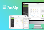
Taskly is a web-based Project Management application that makes it easy for teams to work together to get stuff done. It sets itself apart from the many competitors in the space by combining robust inbuilt communication features, a user friendly interface and the responsive flexibility to work from anywhere on any device.
Tools
Sketch 3
Adobe Photoshop
InVision
Marvel
UXPin
SurveyMonkey
Optimal Workshop
Verify
Pen & Paper
Role
User Experience Designer.
Mentor based student project while on CareerFoundry's
UX Design course.
Mentor: Jeremy Schweitzer
01
Competitor Analysis
I created a competitive analysis of 3 Taskly competitors:
Asana, Basecamp & Jira.
I broke down each competitor’s profile, core business, SWOT profile, UI/UX, content, design and site performance quality.
From the analysis, I identified the main needs of customers in the project management space as:
- team communication and collaboration
- managing files and documents
- tasks and to-do lists
- time tracking
- scheduling and reporting
From these customer needs came Taskly’s Minimum Viable Product (MVP), with the following core features:
- team/private communication
- projects
- calendar
- file management
- dashboard
Surveys
Surveys were used to collect quantitative data in order to validate (or invalidate) my assumptions about customer needs and core features of Taskly’s MVP.
To ensure the survey results were representative of the target audience, I targeted potential and current users of Project Management software through Facebook groups and Slack Channels.
Interviews
Using the information I collected from the competitor analysis and survey, I was able to identify three main problems with the project management web apps currently on the market.
- In-app communication is difficult and there is no way to chat one-on-one.
- I can't see an overview of key project metrics.
- I can't track my time in the app.
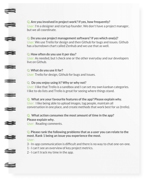
I then conducted interviews with potential users in order to test the problems and collect qualitative data.
From the interview feedback, I validated my assumptions about customer problems and refined the MVP features to include Time Tracking.
Task Model & Customer Experience Map
To help understand a user's experience with Taskly, I created a Task Model and Customer Experience Map.
03
Information Architecture
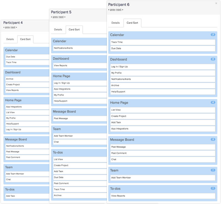
I conducted closed One on One and Remote card sorting exercises to help define information architecture for Taskly.
Based on the results of these exercises, I was able to create
a Sitemap.
04
Paper Prototypes
Initial feature explorations were sketched out and refined, based on user testing and feedback.
05
Wireframes
High-fidelity wireframes of core feature flows allowed me to get a better idea of what the UI elements would look like, and would make it easier to communicate functionality to developers.


06
User Testing
I conducted usability tests with InVision, to test for usability issues in my prototypes. Based on the feedback I received from users, I made improvements to the wireframes.


07
Visual Design
Designing Taskly’s Responsive User Interface, evolved from mood boards, a Style Tile, UI Kit, prototypes of feature flows along with website layouts.
Communication Panel - Interactive Prototype
Time Tracking a Task - Interactive Prototype
08
User Testing
When the visual design was ready to be tested, interactive prototypes along with A/B and First-Click Testing were used to inform and improve the User Interface.
A/B Testing
Was done using Verifyapp.com to increase Taskly’s website conversion rate.
Hypothesis
Moving the testominial section higher up on the page will help to build trust and increase sign ups.
User Feedback
"Word of mouth recommendation is so valuable, it instills a sense of trust before getting to the nitty gritty of the details."
"I like to know what real world users think before diving too far into the product."
Website Landing Page
Key Learning
Users are not you
Assuming everyone is like you and thinks the same way can lead a designer to create inefficiencies in the design. We always need to be seeking feedback from actual users throughout the design process to ensure that what we think works, is what will actually work for the user.
Kill your darlings
We tend to get attached to ideas we come up with and have difficulty hearing other people’s contrary perspectives. We may think it’s the most innovative, original idea but if it doesn’t work for users when tested - it has to be killed. Never get too attached to a specific idea or design. Continuous iteration and change is part of the process of making things better. Nothing is ever perfect.
My UX design process for Taskly
© 2017 Mike Aquan-Assee
