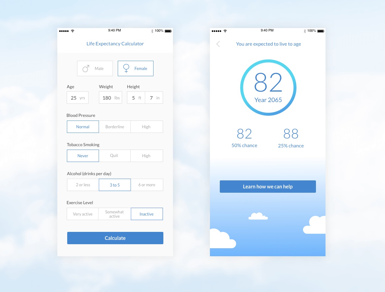


Problem
Lonely Planet is for the traveller. Since 1972, it has been a trusted guide for the journey ahead. The current website design is overwhelming, difficult to navigate and could be improved.
Lonely Planet exists to simplify travel, and that should be reflected in their website.
Solution
By simplifying the amount of options a visitor is presented with on the homepage, we can create an experience that takes the visitor on a journey through a destination while providing relevant information to support their trip.
Tools
Sketch3
Adobe Photoshop
Pen & Paper
Role
Concept and Design (Individual project)
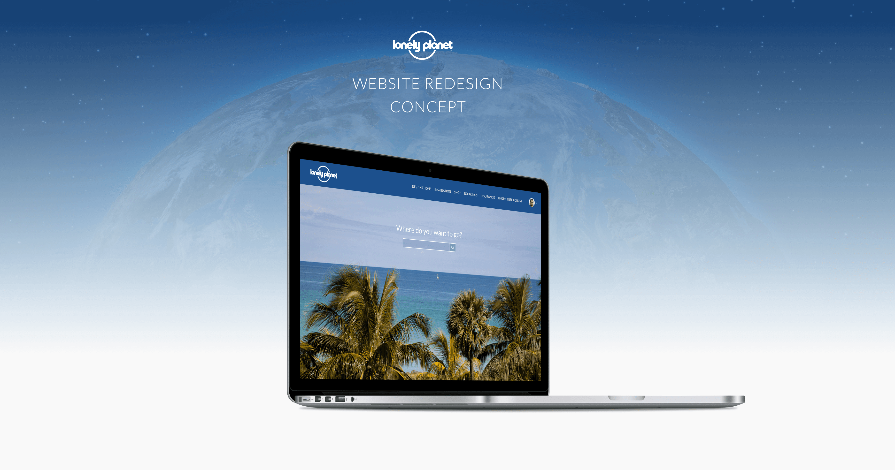
The lonelyplanet.com website
December 2015


Sketches
I wanted to focus on a user flow for a specific destination.
I explored intial ideas and layouts with paper and pencil.


Wireframes
I developed high fidelity wireframes which helps transition to the Visual Design stage of development.
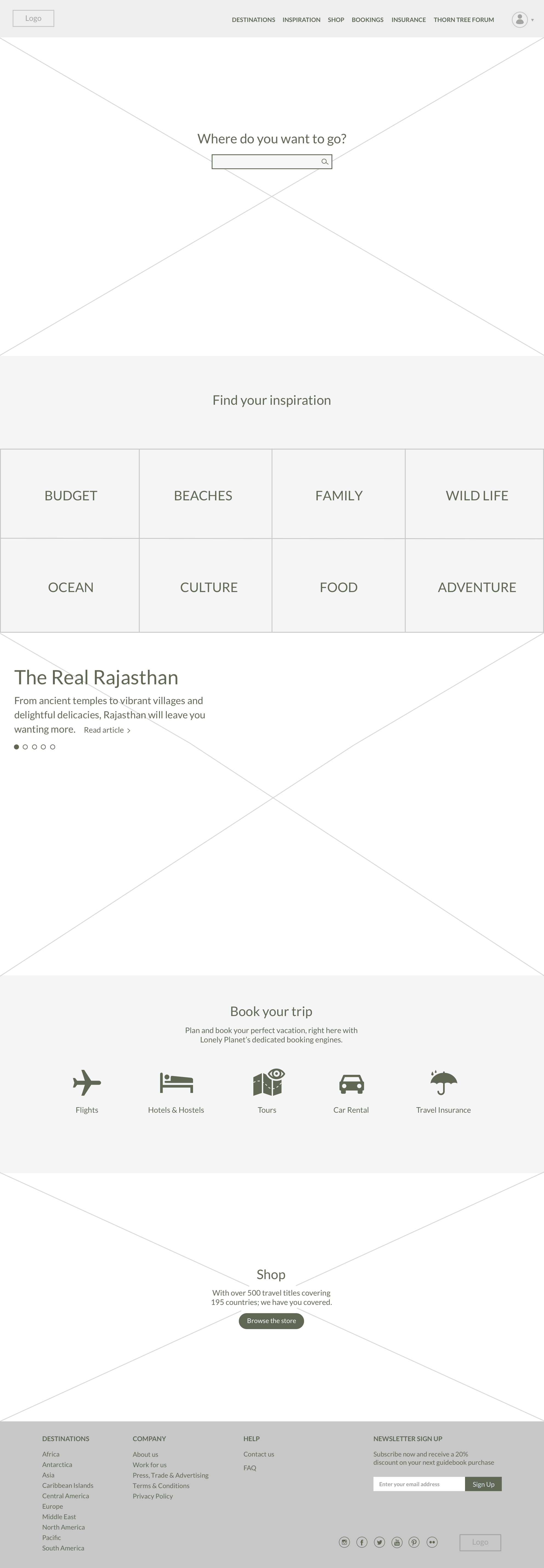


Home Page
Large attractive photos of unique and exotic locations greet the user, whetting their travel appetite. Users can begin their journey by selecting a destination specifically, by category or travel articles if in need of inspiration.


Icons are used for each of the booking sections and clearly showcased on the homepage.
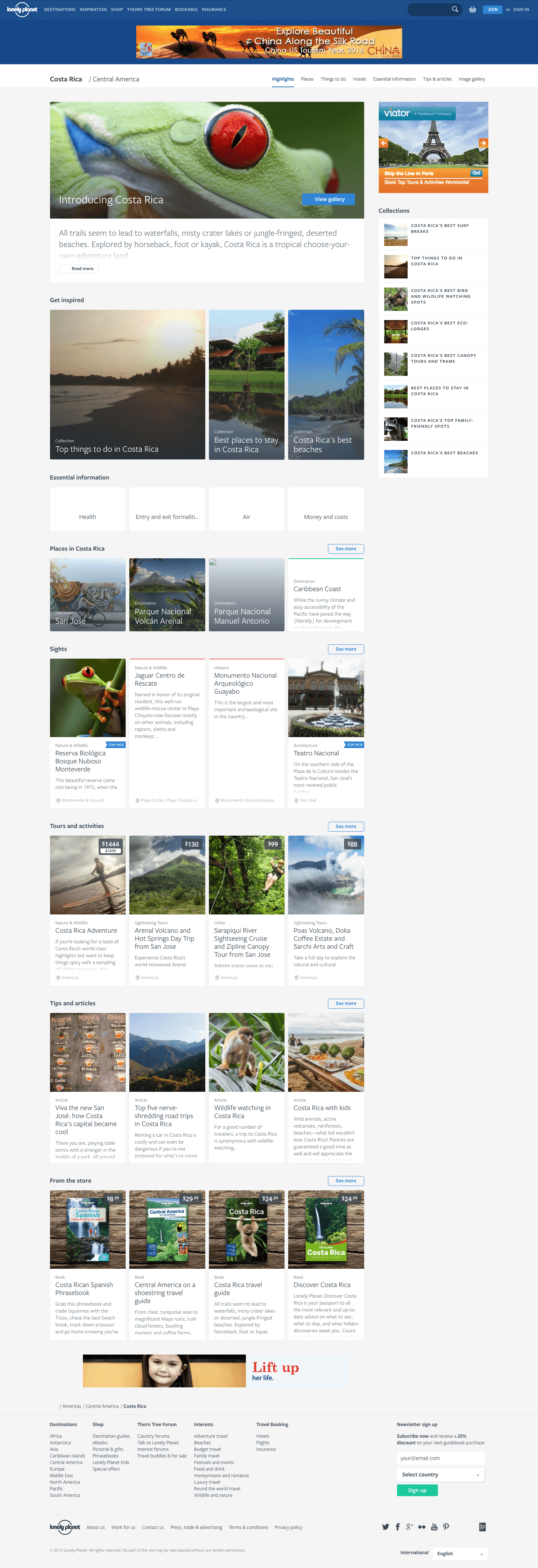
Destination Page
Find out about a country on the destination page. Know the essential information, discover the ‘Top 10 Experiences’, where to eat, sleep and what to do. Don’t forget to buy the guide
before you go.


Get a quick overview about the country as well as essential information.
Sights and Activities
From the ‘See & Do’ section, the user can browse the top rated sights and activities for a country.


Tiles feature traveller ratings to help users choose the best things to see and do. They are categorized by keywords for easy searching, and you can bookmark it while planning your itinerary.
Details Page
Get a detailed overview of a Sight or Activity including, where to stay and eat, and what to see and do.


© 2017 Mike Aquan-Assee